
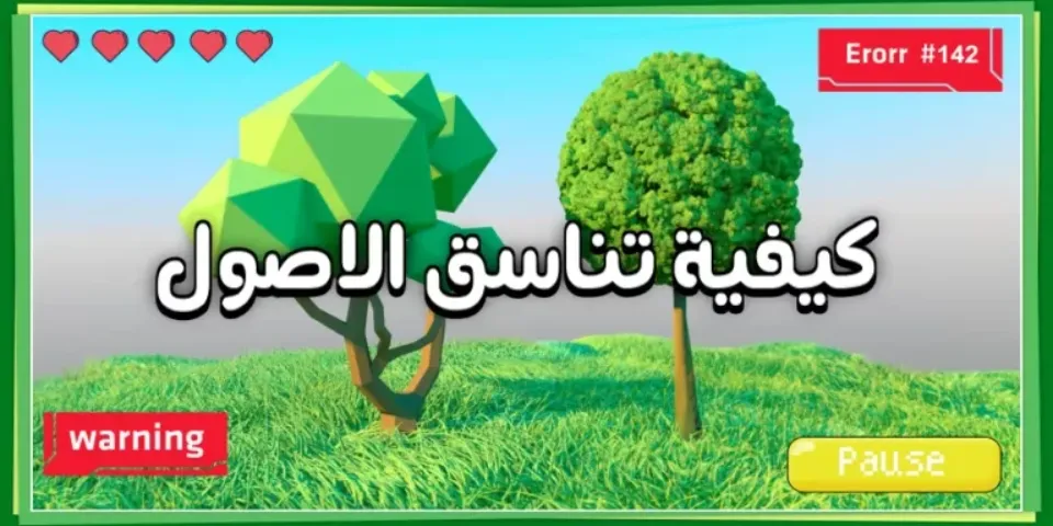
Before you dive into designing your game’s assets, pause for a moment so we can define a core concept that shapes the player experience significantly:
Visual coherence. It isn’t just pleasing aesthetics; it’s a strategic design element that directly affects playability, usability, and immersion in the game world
This coherence lies in a balanced, harmonious relationship between the different design elements of your game—starting with the characters, moving through the environments they inhabit, and ending with the user interface
This coherence can take many forms; some of it is symmetrical, as you’d find in some classic platformer games, where elements repeat on both sides of the screen, and some of it is asymmetrical but still achieves unity and cohesion through a consistent color palette or similar patterns
There’s also functional coherence, which focuses on how elements interact with each other—for instance, the design of a menu button should match the rest of the UI elements
When all the elements are in harmony, whether in terms of art style or function, you’ll have a game with a strong visual identity, one that makes it easy for the player to understand it and interact with it smoothly and effectively
Here’s more detail on each aspect:
The Importance of Coherence Between the Game Environment and Its Characters
To achieve an immersive and convincing gameplay experience, it’s not enough to just design appealing characters or a visually stunning environment. These two elements need to be tied together with a coherent, harmonious visual thread. Coherence between a game’s environment and its characters is the core of building a believable virtual world that easily draws the player in
Imagine, for example, a simple cartoon-style character placed in a highly detailed realistic environment; this contrast pulls the player out of the game’s atmosphere and makes them feel like something’s off
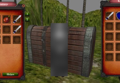
But when the characters’ colors match the surrounding environment’s colors, and the drawing or design styles resemble each other, a sense of harmony emerges that boosts the player’s immersion in your virtual world
This consistency isn’t just about looks—it has a deep effect on how the player perceives the game. Visual coherence helps build a complete visual identity that defines your game’s style and makes its various elements easier to understand
You’ll find, for example, that cartoon-style games often use characters and surfaces with simplified designs, which speeds up how quickly the player understands the different elements in the game
Conversely, in more realistic games, designers pay close attention to the details of both the environment and characters to ensure the gameplay experience feels realistic
Let’s look at a few examples: “The Legend of Zelda: Breath of the Wild” is a standout model in this regard, where the character designs align remarkably well with the aesthetics of the game’s open world
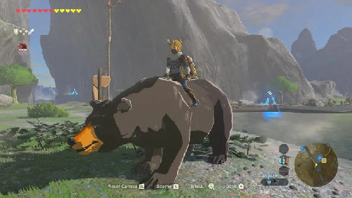
On the other hand, you can find other examples where a lack of coherence is noticeable, which negatively affects the player experience. So focus on this important aspect when designing your game, and you’ll clearly notice the difference
Coherence in UI Design
When designing a game’s UI, don’t underestimate the importance of coherence; just as the characters and environment should be in harmony, the UI needs to be in harmony with them and with the game’s overall style
This coherence isn’t just an aesthetic matter—it’s a core element in enhancing the player experience. Imagine playing a game with highly detailed, realistic graphics, then being met with an extremely simple UI, or the opposite—you’d feel an obvious imbalance that distracts you and reduces your enjoyment
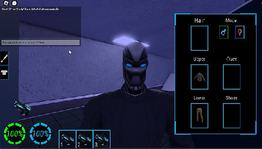
So you should pay special attention to choosing the fonts used in text; do they fit the game’s style? Are they easy to read even from a distance?
Colors also play a critical role—bright colors might suit a kids’ game, while dark, mysterious colors might suit adventure and mystery games. These colors should be coherent with the colors of the environment and characters, forming a complete color palette that reinforces the game’s overall feel
As for the shapes of elements, like buttons and menus, they should be consistent and coherent with each other, following the same style and overall design. Avoid using aesthetically conflicting elements, as that will leave a bad impression on the player
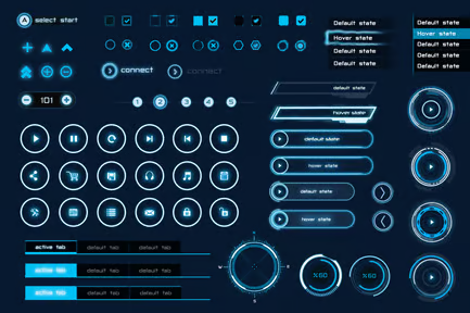
Finally, UI visual effects, such as simple animations when interacting with elements, should fit the game’s style to create a smooth, enjoyable experience, rather than being distracting or annoying
Always remember, the goal is to provide an easy, intuitive experience for the player, one that lets them focus on playing and enjoying the game without obstacles. Studying successful examples from other games will help you better understand the importance of this coherence
Tools and Techniques for Achieving Coherence
To achieve the coherence you’re after between your game’s assets—whether environment, characters, or UI—you need to follow a thoughtful methodology. If you’re not an expert in graphics, don’t worry! There are simple tools and techniques that can help you get there
Start with careful research into assets that suit your game’s style, and precisely define what you need in terms of art style, file size, and art quality
Don’t hesitate to use search engines specialized in images and digital assets to make the search process easier, while keeping usage licenses in mind to avoid legal issues
We have an earlier article titled Assets in Game Development and How to Get Them that you can check out to learn about a variety of sites offering ready-made assets for game developers
And if you can’t find exactly what fits your vision, don’t give up! Use image or graphics editing software to modify existing assets, or even create new assets using your own basic skills, or by relying on tutorials available online
To achieve color coherence, look for inspiring sites that offer ready-made, harmonious color palettes, or use color analysis tools to draw on the palettes of other successful games
Notice how colors were used in games similar to yours, and try to understand the message those games are trying to convey through their color choices. Don’t hesitate to try different color combinations before settling on the best option, while keeping in mind the effect these colors have on the player’s mood and experience
Some color sites we recommend:
And finally, don’t underestimate the importance of asking for expert feedback in this field, as they may offer valuable advice that helps you improve the coherence between your game’s various elements and avoid common mistakes
And here at Kinmatik, we’re always available to help you—you can send us your game or show it to us through any of our communication channels
Practical Examples and Recommendations
Now let’s see how coherence principles are applied in successful video games. Let’s take a look at some notable titles
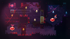
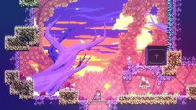
Notice, for example, how “Celeste” managed to achieve remarkable coherence between its simple character design and its gradient, harmonious environment colors, giving it a unique aesthetic and helping convey the feelings of sadness and hope the game embodies
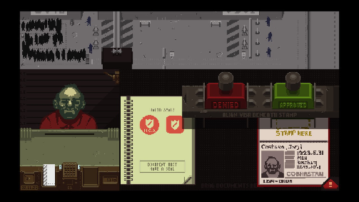
As for “Papers, Please,” it’s a great example of how a limited color art style can serve a game’s atmosphere built around routine and bureaucracy, through precise coherence between the UI design and the visual details of the environment surrounding the main character
And that’s not all—these examples also highlight the importance of carefully planning graphical assets from the very start of the development process
Always remember that choosing a specific color palette helps unify the game’s overall atmosphere, and that settling early on a single art style makes managing visual assets easier and ensures better coherence
Don’t hesitate to draw inspiration from other games, but try to add your own personal touch so your work comes out with a unique, distinctive style. And if you’re looking for a more detailed case study, look into independent games that achieved wide success and see how they applied the principle of coherence in their designs
The most important thing is to start by defining your visual goals and artistic needs, then choose the style that best serves those goals
Avoiding Common Mistakes
On your journey toward building a coherent game world, you’ll inevitably run into some visual obstacles. To avoid falling into the traps of visual inconsistency, let’s shed light on some common mistakes that might hold you back
First, choosing assets with clearly inconsistent quality; using high-resolution 3D models alongside noticeably low-resolution ones creates an obvious clash that distorts your game’s aesthetics
Or imagine, for instance, a game’s hero with stunningly fine detail interacting with a roughly rendered environment! The solution here lies in deciding on the required level of graphics quality and sticking to it across every part of the game
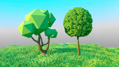
Second, pay close attention to your color palette choice. Color coherence isn’t just an aesthetic matter—it’s a core element in guiding the player and creating a specific mood
Sharply clashing colors can cause visual fatigue and distract attention, weakening the gameplay experience. So focus on using a harmonious color range, while making sure to use the right color shades to create the necessary contrast without harming the overall coherence
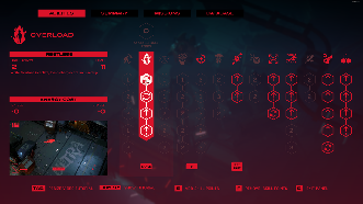
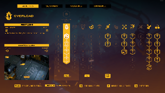
Finally, don’t underestimate the importance of UI design. Confusing or unintuitive interfaces can frustrate players and drive them away from enjoying your game. Make sure your UI elements are clear, easy to use, and consistent with the game’s overall style
Remember, visual coherence isn’t a luxury—it’s a necessity for creating an enjoyable, seamless gameplay experience. Avoid these mistakes, and you’ll be on the right path to building a coherent, harmonious game world that satisfies players and enriches their experience